Monday, 13 February 2012

Part 2- UDK test, Temporary Texture s and Building props with UV’s.

1. Scale up by 1.7 because of unreal grid.

 2. Felt like “Texture Time” using my own photo texture to make it. (THESE MIGHT NOT BE THE FINAL TEXTURES )


3.


4. Deciding what kind of extra design I will have on my pillars? I decided on the left one highlighted.


5.


6. Door design problem of opening because it will need to slide open, so I made it deeper.

7.

 8. (Should have used the Maya Grid =( )


9. Quick blimp prop.

10. Using Check board texture to determine how skewed the textures are and to change the uv’s if necessary.


Friday, 10 February 2012

Part 1 MA Semester 2- Block Mapping

My first semester was all about sharpening my skills, researching architecture, making a new style and to have some type of documentation of my work.

My second semester will be all about building my style of architecture in a large scale and get it as beautifully drawn as possible before placing it from Maya to UDK. The style will be mine, the texture will be my own photos and the level design is my experimentation. This will lead up to my third semester when I will apply game mechanics and make the level more playable with a UI, animations and if I have the time enemies. This will achieve a balance of puzzle, agility (things to avoid and climb) and action (enemies) the three main areas that faem the backbone of games.

I am planning to create a Nouvic ruined temple that has 1930-40’s technology Nouvic themed machines that moved in and later were abandoned. The location will be an Amazon foliage, so the temple will be overgrown covering half the section and the main hall.    

I intended to post screenshots of my progress instead of writing descriptions of each screenshot and would like to see the readers of this blog to comment, ask questions, advice and criticism would be welcome.  

1.

2.


3.

4.

5.

6.
7.

 8.
9.

Friday, 9 December 2011

Thursday, 8 December 2011

Nouvic Clock Journey Part 8

Render scene and final touches.

1.


2. Same lighting from before and I forgot to turn off the “cast shadow” function on the wall box.

3.

 4.  The shadows look noisy because I haven’t increased the shadows and shadow depth in the Raytrace option because this enabled me to cut down on render time (I will increase it when I think its just right).

 5. Started playing with the light colour. Blue left, Yellow middle (cast shadow) and Red right. I learnt that the light to the left and right affects the middle shadow.

 6.  Yuk! So I used blue left, green middle and red right.

 7. Now Light Blue (innocence), Middle Pink (passion) and Red (love). I went with colour emotions. One colour can mean different things like Red for instance love, blood, gore, stop and more.

 8. Red(love) , Green (nature) and Orange (warmth). Hmmm… time to really play with the colours to get it just right for the theme.

 9. I think I might have a winner. Green (natural), Orange (warmth) and Red (passionate)


10. Hmm… It looks slightly different from the other side because of the position of the light (this image has also been enhanced in quality).

 11. Time to increase shadows, shadow depths, resolution and viewed from different camera angles.


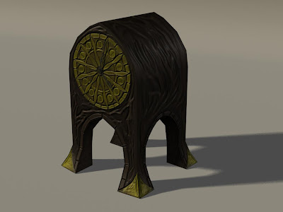
This one is my favourite because of the flowing wood carvings has a gradient of green and red that complements the wood texture. The yellow just gives it that extra shine. The knowledge I have gained from this project has got me excited for my next project.
218 tri clock and 4 tri clock hands.

Nouvic Clock Journey Part 7


I found a really interesting Normal Mapping tool called Ndo

1. But first I need to change the clock hand material to a Lambert because the transparent areas were reflecting light. I then positioned the hands on the clocks face.


2. First stage (optional) was to change it into black and white by using the black and white tool or Hue/Saturation.

 3. I then tampered with the exposure tool (this maybe a mistake but it’s all experimental). I had already installed it into Photoshop so it should show up in the macro section. I then press play and bam! It was turned into a normal map and a menu popped up.

 4. This is what it looked like. I’m extremely new at this software so bare with me. The menu is there to change the normal map to whatever normal map you like (It’s just a matter of learning by trial and error).
 5. I clicked “Save” and experimented but chose not to close down the window, just in case I was not happy with the results.

 6. I then went to Maya to try on the normal map to see what’s it like and continued by going into the bump mapping option in the material menu and pressed “File” to search for the normal map.
Ahhh! Not happy with results. It seems to have picked up a large amount of the wood grain in my texture and where I had pen marked in the textures it picked up every stroke of the brush. (trial and error)

7. When in doubt look online! I found a handy website that tells me the function of the Ndo menu. I found the function “Make sculpt layer” I was impressed. I could fully customise the normal map to my liking and learnt to smooth out the normals so it didn’t get that nasty sketch look. I felt at home using the Photoshop brushes and tools to just hand paint what I want to stand out. It’s slowly coming along but unfortunately time is a major factor for hand drawn art. But it gets results in a render.


 8. This is what it looks like coming out of “Make sculpt layer” and teaching me on how the normal map is formed.
Out of sculpt mode into the Ndo menu, save and then render it in Maya for the result.

9. The clock face was a big challenge and after all this hard work I’m still not totally happy with it. I might tackle this later because I am having trouble mastering the Ndo techniques. Taking a personal note* I should have gone for a simpler clock face design…

 10. I changed the martial of the clock back into Blin and kept on rendering it to get a good polished look.
Image size mess up!
11. Went back to normal Mapping and applied the same technique of hand drawing with the pressure brush and smoothing it with the blur tool after. In the screen shot it shows the clock in sculpt mode and then back into normal menu.


12. I found that I could copy my colour texture above the sculpt layer and then overlay and turn down opacity to be a guideline for normal mapping.


 13. It was then time to move on to the feet and side arches and try and get them just right. I applied a 100 opacity brush on the arch bricks and then erased it so it didn’t stick out too much.


 Render scene and final touches were going to be carried out next but time was of the essence and I might not be able to do it as I really don’t think I have the time to do the other two for my project of self discovery.