1. UV Screenshot, the UV map. This will bring up options of what resolution size I want to save the file as.

2. This is what it will look like and so for the other UV maps I repeated the process twice.

3. I wanted to find the right photo texture by using my own camera to get the right texture for my wooden clock. I encountered problems because all the furniture I found had a bad shine on the surface because of the polish. So I asked a friend to sand down an old piece of oak in order for me to take a picture of it. I chose old oak because it was a hardwood similar to walnut. I also learnt that softwood has larger spaces between the age rings than hardwood.


4. I then chose a Lambert made clock to begin with and to see what it’s like when shown in Maya with the default lighting.

5. Just for a quick reference I quickly made a rendering scene. It contains two directional lights and an ambient light. First directional light will be the main light that will cast the shadow and the Second will lighten the other side slightly. The ambient light will be placed slightly behind in order to have some light from behind. I would then after the shadow setting for the main light in order to lighten the shadow to my satisfaction.

6. I then carried out an extra rendering setting by turning off the default lighting and changing the resolution of render. I would then set the lights, the main clock, scene, experimental clocks, bits and bobs and other clocks on separate layers (I could assign a colour to them so the wireframe will change the colour).

For reinsurance I turned down the resolution temporarily whilst testing the render to produce quicker results.

7. I changed the material to Blin for experimental reasons and started to experiment with the reflectivity and how shiny I needed it (I don’t need much).

8. Trial and error. Over a few minutes I quickly sorted out a temporary rendering set up. I added a shadow, changed the shadow to become lighter and added a slight tint of yellow and get the shadow just about acceptable.

9. More trial and error took place to get the lighting just right. At this point I went back into Photoshop and changed the wood texture to be a little lighter.

10. The temporary final Render in Maya software.

11. I put the wireframe lines on a separate layer and use them as guidelines (guidelines that you have to follow unless it’s an alpha then you don’t have to.)

12. After making a sketch of the wood grain texture I went back into Maya to see what it would look like. I will be doing this a lot because its gives me instant feedback of what it will be like and how the light effects it.

13. At this time I managed to sketch out the main parts of the clock and using these sketches as references. As that moment in time I felt like I was really drawing on a piece of wood this reminded me of woodwork class.

14. I started to roughly sketch the main clock face, using the duplicate tool to make the design symmetrical.

15. I used the sketch as a guideline and made a yellow circle for the clock, as I always remind myself at this stage to put on colour before going straight into detail because its important getting the base colour down. The reason while I’m not using a photo image of a clock face its that it adds unwanted shine to it and it would not be my own design.

16. My next step was to use the Bevel and Emboss tool to get the right shadow and a little shine and then merge it with an empty layer. Naturally I would see what’s it like in Maya.

17. Next was to paint the feet gold. I quickly painted it and then shaped it by using the wireframe as a guide.

18. I made separate layers for the golden face and when I was happy with the colour I merged the layers.

19. I then went into a little detail adding sharpness to the clock. I did this by adding a very light yellow and a very dark yellow to define distance of light and dark (light close to and dark a distance away to back up the light sections.).

20. Inspiration! During a trip to a sculpture park I found an interesting tree that looked like it was made up of warped branches this reminded me of an art nouveau clock design. I felt like I have done too much gothic design and so I decide to change the design to more of a whiplash design. First I change the properties of my brushes to be more pen pressure sensitive to give a good appreciation of depth.

As you can see I rubbed it all out and followed my vision. I had an extra idea to add a symbol that resembles gothic in the centre and to be perfectly honest I’m beginning to slowly like this design.

21. After the big design change I had a looked in Maya and liked what I saw. So I applied the design to the front keeping in mind the gothic symbol.

22. Then I designed the back of the clock and thought about the main mechanics of the clock, it being a working object that would need maintenance to keep it running. I therefore put in a back panel and a gold coloured hole to give the impression that it could be wound up.

23. I returned to drawing out the clock face by duplicating one of the detailed pattern and rotating it by way of a pivot in order to get the same amount of detail.

24. I always take the zoom back to see what’s it like from a distance and to check if I have gone out of the wireframe, I made some quick finishing touches to get the clock number panels forward.

25. Continued to detail the gold, it was a challenge to get the gold just right but I still feel the gold doesn’t look right. I have used gold reference, so I guess it’s a learning curve which I haven’t fully grasped yet.

26. Whoops! forgot to do the inside leg of the clock. This was a pain because I had to line it up with the archways.


27. I figured that I would bear in mind the wireframe and use the edges on the mesh as the bevel of the tile work. To save time I added a bevelled brown line at the edge so it didn’t matter if it did not line up exactly.

28. Just to add more of a definition I added a slight gradient onto the bevel edges.

29. A little tint of orange, it looks better but hmm…

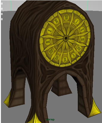
30. Final touches. I started to add the numbers on the clock face. I decided to go down the gothic route of using roman numerals. I looked carefully at a roman numeral clock I had in my hand and found that the numbers were more stream lined. I thinned the numbers and rotated them around the clock as they were traditionally donw on an gothic clocks.

I just had to look at what it looked like in Maya.